
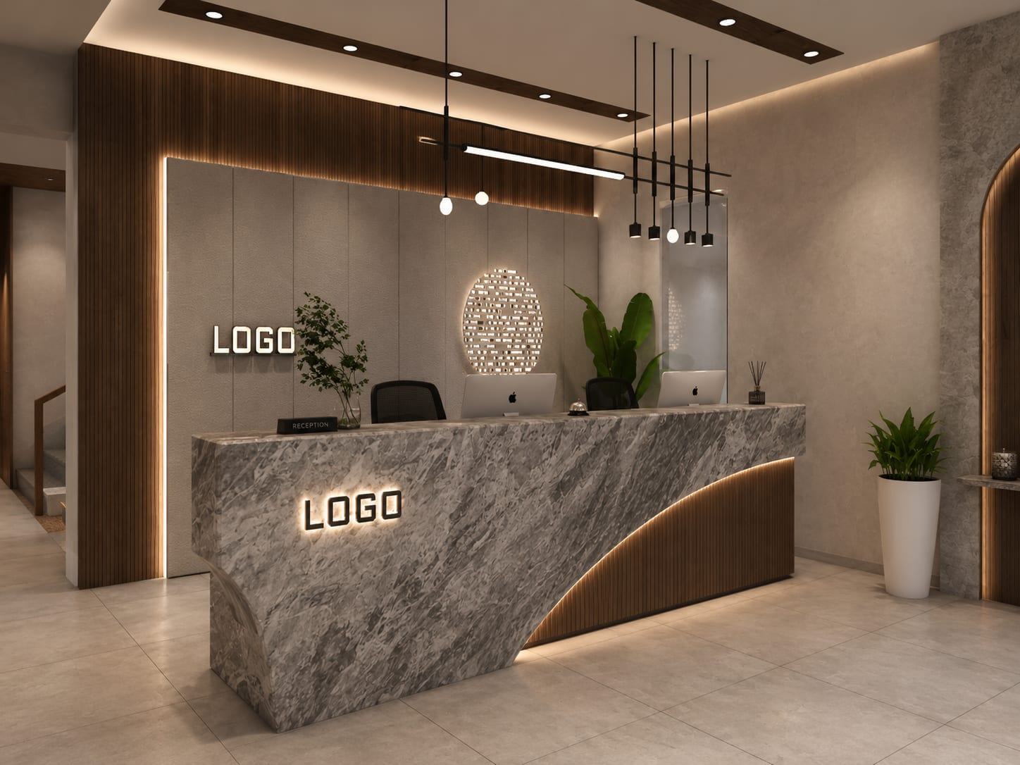
A reception that tells visitors where they are, and that they were expected.
Reception is the first minute of every visit: finding the desk, being greeted, waiting without being in the way. We plan the arrival sequence, the desk, the waiting area and the route into the office, then let materials, light and proportion carry the brand.
Businesses hosting clients on site
Professional firms and consultancies
Offices with regular walk-in visitors
Companies refreshing a dated front desk
Arrival, greeting, waiting and the way in, as one sequence.
A reception is judged in the walk from the lift to the desk. Can the visitor see where to go, can the receptionist see them arrive, is there somewhere to sit that is not a thoroughfare. We plan those moves first, then set the desk, lighting and materials so the space reads as your brand without a wall of logos.
Arrival Sequence
The route from lift or door to desk kept clear and visible, with wayfinding built into the plan so visitors do not have to ask where to go.
Reception Desk & Sightlines
Desk height, position and screening set so staff see every arrival and stay comfortable, with storage and equipment out of the visitor's view.
Waiting Area
Seating placed off the main path with a table, power and a view, so guests wait comfortably without watching the office at work.
Brand Expression
Identity carried through proportion, material and lighting, with signage kept measured, so the room feels like the company rather than a billboard.
Lighting Layers
Ambient, feature and desk lighting layered so the desk is the brightest point and the waiting area is softer, by day and in the evening.
Security & Visitor Flow
Visitor sign-in, access control and the door into the working office placed so security is present without feeling like a checkpoint.
What a good reception does in its first thirty seconds.
The plan comes before the desk. A visitor stepping out of the lift should be able to see the reception desk, and the receptionist should be able to see them, without either having to crane. The waiting area should be visible from the desk but off the main path, so someone waiting is not in the way of staff coming and going. The door into the working office should be clear but controlled. Once those relationships are fixed, the finishes have somewhere to sit.
The desk itself carries most of the impression. Its height needs to work for a standing visitor and a seated receptionist, with a lower section if you expect wheelchair users or parcels. Behind and below the counter is where printers, deliveries and bags accumulate, so storage is designed in rather than left to chance. The material on the front face is what visitors touch and photograph, so it should be durable and warm rather than only glossy.
Brand is better expressed through the room than through signage. A consistent material palette, a considered proportion for the desk and backdrop, and lighting that gives the space a clear focal point communicate more than a large logo. A single, well-lit name behind the desk is usually enough. Visitor privacy also matters: waiting guests should not be able to read the screen or overhear the calls at the desk.
Lighting and acoustics finish the sequence. Layered lighting keeps the desk the brightest point, gives the waiting area a softer level and adapts from daylight to evening. Hard floors and glass make receptions echo, so a rug, upholstered seating and an absorbent ceiling keep voices down. Small operational details, such as where umbrellas, courier parcels and visitor badges live, keep the room tidy through the day.
Six stages, each with a clear purpose.
Conversation
Site Understanding
Concept Direction
Design Development
Execution
Styling & Handover
Questions people ask before redoing a reception.
A clearly visible desk with sightlines to the entrance, a waiting area off the main path with seating, a table and power, storage for equipment and deliveries, visitor sign-in and controlled access into the office, and lighting that makes the desk the focal point. Branding is carried mainly by material, proportion and light, with signage kept measured.
It depends on how many visitors arrive at once and how long they wait. A consultancy with a few scheduled guests needs a small waiting area; an office with daily walk-ins or interview days needs more seats and a way to keep them out of circulation. We plan from your visitor pattern rather than a fixed area.
Through the room itself. A consistent palette drawn from the brand, a desk and backdrop in good proportion, feature lighting that gives the space a focal point and one well-placed name are usually enough. Materials that reflect what the company does, such as timber for warmth or stone for solidity, say more than repeated graphics.
Usually, yes. Reception work can be phased with a temporary desk and sign-in point, dust screens and out-of-hours scheduling for noisy tasks. We document the existing services, plan the sequence with your facilities team and keep the entrance usable throughout.
It should belong to the same family without being identical. Reception can carry richer materials and lighting because it is the visitor's first impression, while the working office uses a calmer, more practical palette. Consistent proportions, a shared colour base and the same door and signage language keep the two connected.
Related interior design services
Refreshing your reception or front of house?
Tell us who visits, how often and what happens when they arrive. We will talk through the sequence, the desk and the waiting area before any drawing starts.