
Office Reception Design: Making the First Thirty Seconds Count
Materials, lighting and a well-planned waiting area shape a visitor's first impression long before anyone says a word.
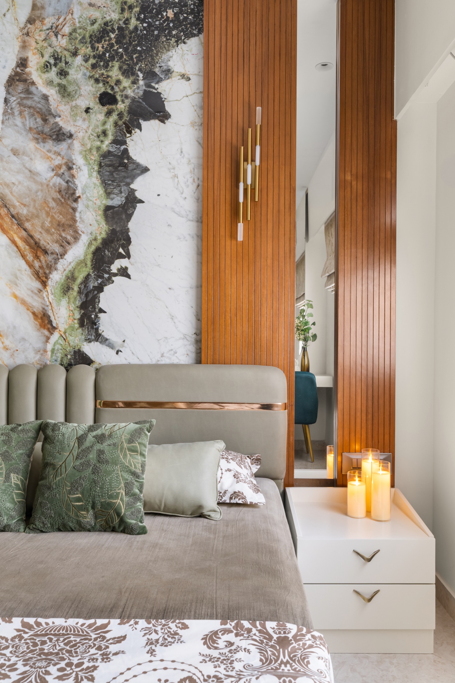
A visitor forms an opinion of a company in the time it takes to cross a reception floor, long before anyone shakes their hand. That makes the reception one of the highest-leverage rooms in an office to get right, and one of the easiest to get wrong by treating it as a corridor with a desk in it rather than the first real room of the brand.
Say Something Before Anyone Speaks
The strongest receptions communicate what a company does or values without a single sign. A materials palette that echoes the product, a piece of art that reflects the founders' taste, or a wall that simply does one thing beautifully — timber slats, a hand-finished plaster, a considered shade of colour — says more than a logo lit up behind the desk. Save the literal branding for smaller, quieter touches: a monogram on a door handle, a colour repeated in upholstery.
Resist the instinct to fill every wall. A reception with one confident material moment and generous breathing room around it reads as considered; one crowded with a feature wall, a branded floor graphic and a video screen all competing at once reads as anxious, however good each element is on its own.
Design the Wait, Not Just the Desk
Most reception briefs focus on the front desk and forget that visitors spend most of their time in the seating next to it. That waiting area deserves real furniture — chairs a person can sit in for fifteen minutes without shifting, a low table for a laptop bag, and enough distance from the desk that a visitor doesn't feel like they're listening in on the receptionist's calls.
Give the waiting zone its own light source rather than letting it sit under the same downlights as the circulation path — a floor lamp or a pendant at a lower height changes the mood of the corner instantly. And keep sightlines in mind: a seated visitor should have something worth looking at, whether that's a view out, a piece of art, or simply enough distance from the lift doors to feel settled rather than watched.
Materials That Age Well Under Constant Contact
A reception floor and desk front take more daily contact than almost any other surface in the building — trolley wheels, bag corners, hundreds of hands on the same edge. Choose finishes for how they age rather than how they photograph on day one: a honed stone or a good quality engineered floor over a high-gloss finish that shows every scuff, and a desk front in a material that can be wiped down repeatedly without dulling.
- A durable, easy-clean floor at the entry zone, distinct from softer flooring further in
- A desk front finish that survives daily contact without showing wear quickly
- Layered lighting: general, task light at the desk, and an accent for mood
- A planting element, live where maintenance allows, that softens hard surfaces
- Acoustic control near the desk so calls and conversations don't carry
- Clear, uncluttered signage for lifts, washrooms and onward direction
Lighting Decides the Mood More Than Any Finish
A reception lit entirely by ceiling downlights, however well specified, tends to feel clinical. Layer in a lower, warmer light source — a pendant over the desk, wall-mounted fittings at seating height — so the room has depth after dark and doesn't rely on daylight alone to feel welcoming. Warm white light in the 2700 to 3000 kelvin range generally reads as more hospitable than a cooler, office-standard tone in this specific zone.
Daylight, where the site allows it, is worth designing around rather than screening out. A reception with a view to greenery or a well-placed skylight rarely needs much artificial decoration to feel good; the effort is better spent on framing that view than on adding fixtures to compensate for its absence.
The Desk Itself Is a Small Building Problem
A reception desk has to work for someone standing and someone seated, hide cabling and a computer setup, and still look considered from every angle a visitor might approach it from. Get the ergonomics resolved early — desk height, a lower accessible section, space for a keyboard and monitor that doesn't force awkward reaching — because a desk that looks right in a rendering but is uncomfortable to sit at all day undermines the whole room.
Cabling and equipment are the usual culprits when a good design looks messy in practice. Plan a service void or a rear cabinet into the desk from the start so monitors, routers and chargers have somewhere to live out of sight, rather than trailing across the surface a visitor is looking at while they sign in.
A reception is a small room with an outsized job: it has to be the whole company, distilled into the first thirty seconds.
Planning your own home?
Let us collaborate to shape your home or office with the care it deserves.